
How to Log and Recreate the Dominant Color Schemes of Your Destination
Every legendary destination has a “soul color.” If you close your eyes and think of Santorini, your brain likely floods with a crisp, high-contrast duo of Aegean blue and whitewashed stucco. Think of Marrakech, and you’re immediately enveloped in a warm haze of dusty terracotta, saffron, and deep cobalt. Think of the Pacific Northwest, and it’s a moody gradient of moss, slate, and charcoal.
We often try to capture these vibes through the lens of a camera, but digital sensors frequently struggle to replicate the true “temperature” of a place. A photo captures a scene, but a Color Palette Log captures a feeling.
Logging the dominant color schemes of your travels is one of the most effective ways to sharpen your observational skills and create a sensory-rich record of your journey. Whether you are an aspiring artist or someone who just wants their travel journal to feel more “alive,” mastering the art of color capture will change the way you see the world.
Learn more about our Quick-Fill Travel Journals for ANY Destination. Options for All Ages available.

The Science of Color and Memory
Our brains are hardwired to associate color with emotion and location. This is why a specific shade of yellow might suddenly remind you of a hidden street food stall in a bustling market, or a certain muted green brings back the quiet humidity of a tropical forest.
By intentionally logging these colors in your travel journal, you are creating “anchor points” for your memories. Instead of a vague recollection of “a pretty sunset,” you have a documented palette of burnt sienna, violet-grey, and pale apricot. These specific details act as a key, unlocking the sensory vault of that moment years after you’ve returned home.
How to Identify a Destination’s Palette
When you arrive in a new city, the sheer amount of visual data can be overwhelming. To identify the dominant color scheme, you need to filter out the noise.
1. The “Squint Test”
This is a classic technique used by painters. When looking at a cityscape or a landscape, squint your eyes until the details blur. What are the 3 or 4 blocks of color that remain?
- The Foundation: This is usually the color of the architecture or the earth (e.g., grey limestone, red clay).
- The Accent: The color of the shutters, the local taxis, or the flowering trees.
- The Atmospheric: The color of the sky at your favorite time of day or the shadows in the alleys.
2. The 60-30-10 Rule
Borrowing from interior design, look for the ratios of color in your environment:
- 60% (Primary): The background color that defines the landscape.
- 30% (Secondary): The supporting color that provides contrast.
- 10% (Accent): The “pop” of color that makes the destination unique.


Methods for Logging Color in Your Travel Journal
You don’t need a full set of professional oils to be a color journalist. In fact, some of the most beautiful logs are done with the simplest tools.
Method A: The Swatch Block
If you carry a small set of travel watercolors or even colored pencils, create small 1-inch squares at the top or bottom of your journal entry.
- Prompt: Label each swatch with a name that describes its source. Instead of “Blue,” call it “Calamari Boat Blue” or “Midday Shadow.”
Method B: The Descriptive Adjective List
If you prefer writing, use your journal to “paint” with words. Avoid generic color names. Use comparisons to local objects to define the hue.
- Example: “The walls were the color of sun-bleached bone, accented by doors painted in a sharp, electric turquoise that matched the plastic crates at the market.”
Method C: The Found-Object Palette
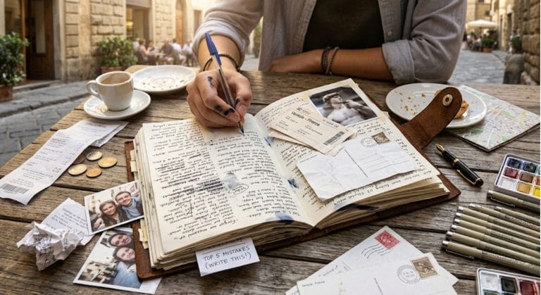
For a tactile experience, tuck small bits of the destination into your journal. A local postage stamp, a dried wildflower, or even a scrap of a colorful flyer can act as a permanent color reference for that location.
The “Quick-Fill” Philosophy for Busy Explorers
Let’s be honest: when you’re navigating an overland route through a new region or trying to catch a ferry, you don’t always have time to sit down for an hour and mix the perfect shade of “dusty road orange.” If your journaling system is too complex, you’ll stop doing it when the pace of travel picks up.
This is where the Quick-Fill methodology becomes a game-changer. The goal is to capture the essence of the color without the labor-intensive process of painting.
If you use a system like the Quick-Fill Travel Journals, you already have a structured framework for your daily logistics—weather, budget, and highlights. By having these “bones” handled, you can use your remaining creative energy to simply jot down your “Color of the Day” in the margin.
A Quick-Fill color log might be as simple as:
- Dominant Neutral: Damp Concrete Grey
- Pop of Color: Street Vendor’s Umbrella Yellow
- Shadow Tone: Deep Plum
This takes thirty seconds, but it provides a vivid visual anchor that makes your log feel far more professional and evocative than a standard diary entry.
Advanced Color Journaling Prompts
To take your color logging to the next level, try these prompts that challenge you to look deeper into the environment.
- The Shadow Audit: Look into the darkest corner of a street. Is the shadow truly black? (Usually, it’s a deep purple, blue, or even a dark green). Document the “temperature” of the shadows.
- The Weather Shift: How does the city’s palette change when it rains? Does the dull grey pavement become a mirror for neon lights? Does the red brick turn into a deep burgundy?
- The Human Element: What is the most common color people are wearing? In some cities, there is a distinct preference for neutrals; in others, the local textiles create a moving rainbow against a monochromatic background.
Bringing the Palette Home: Recreating the Scheme
The magic of a Color Palette Log is that it serves as an “Inspiration Board” once you return home.
- Digital Content: If you’re a creator, use your logged palettes to inform the color grading of your travel videos or the design of your blog graphics.
- Interior Design: Many travelers use their color logs to pick paint colors or textiles for their homes, creating a subtle, daily reminder of their favorite journeys.
- Creative Projects: Use the logged palettes as a starting point for sketches, paintings, or even a curated travel photo book.
Final Thoughts
We travel to see the world in high definition. By taking the time to log the dominant color schemes of your destination, you are training your eyes to appreciate the subtle gradients and bold contrasts that make every place unique.
Your travel journal is more than just a list of things you did; it is a museum of where you’ve been. Fill its “galleries” with the ochre of the desert, the teal of the ocean, and the vibrant neon of the city. When you look back, you won’t just remember what you saw—you’ll remember the exact light of the world in that moment.
Ready to capture the world in full color? Explore our collection of Quick-Fill Travel Journals at The Explorer’s Nook—the perfect structure for logging your logistics, your colors, and your greatest adventures.
Check out our Quick-Fill Travel Journals on Etsy:


Quick-FIll Travel Journal for ANY Destination
The travel journal for explorers who want to remember everything, but would rather be living the adventure than staring at a blank page.

FAQ
A travel color palette is a selection of 3 to 5 dominant hues that define the visual essence of a destination. It usually includes a primary background color (architecture or nature), a secondary support color, and a vibrant accent color unique to the local culture.
You can swatch colors using travel-sized watercolors, colored pencils, or markers. Create small geometric blocks (circles or squares) and label them with descriptive names related to the environment, such as “Rusty Gate Red” or “Monsoon Sky Grey.”
Logging colors improves observational skills, anchors sensory memories more effectively than photos alone, and provides a “creative blueprint” for future projects like home decor, digital design, or art. Using a “Quick-Fill” journaling method makes this process fast and easy for travelers on the move.
What’s the most “colorful” place you’ve ever visited? Did the palette surprise you? Let’s talk about it in the comments!